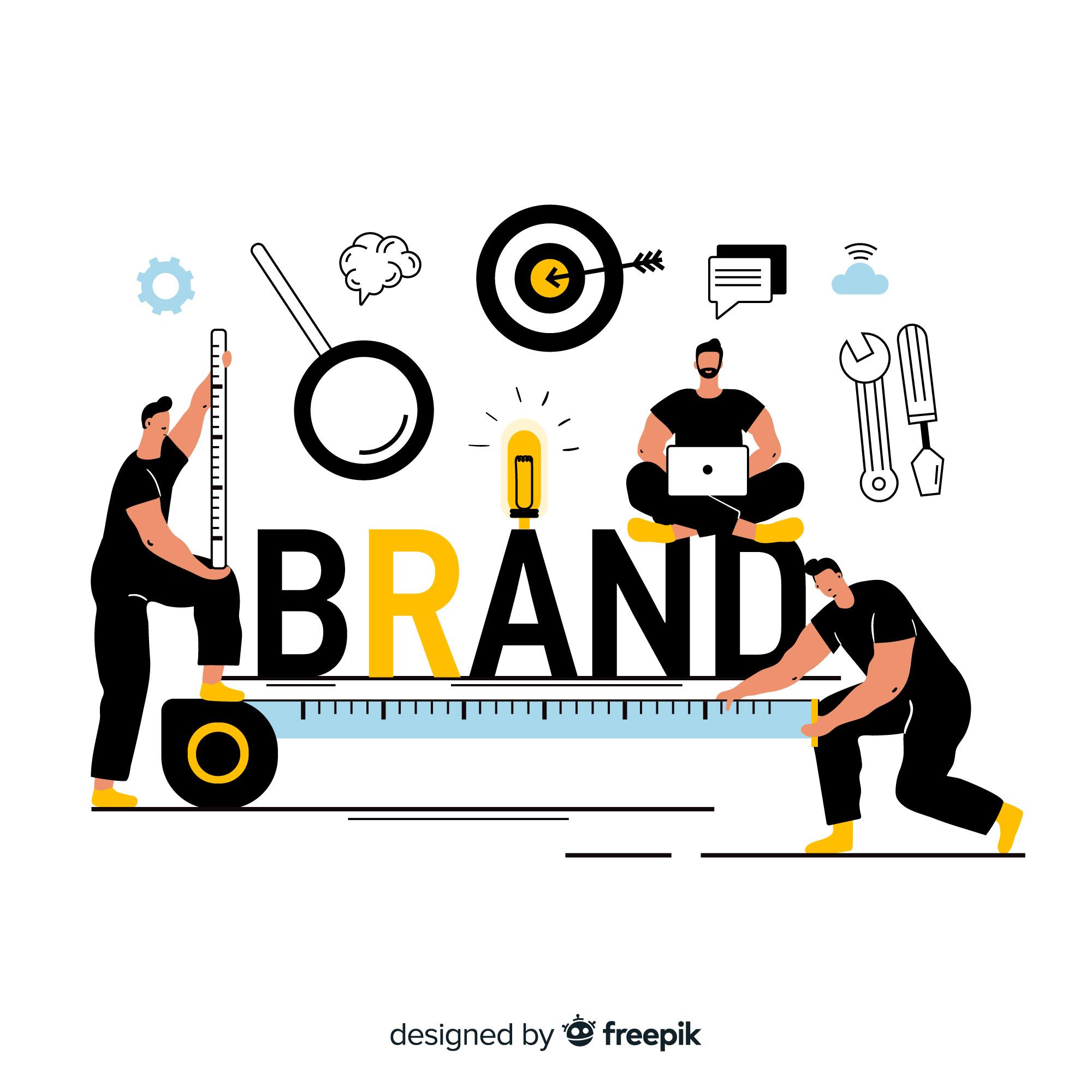
When I first started creating brand identities, I was obsessed with visuals like logos, colors, and typography. I thought that was the essence of branding. But the more I worked with real brands and audiences, the more I realized something powerful: people don’t see a brand first, they feel it.
Understanding How Design Shapes Perception
Design is emotion in disguise. Every color, font, and shape sends a subtle message about who a brand is and what it stands for. When I work with new clients, I often ask, “If your brand were a person, how would it walk into a room?” That one question reveals everything: tone, style, and presence.
- A minimal, clean design often feels modern and confident.
- Soft curves and muted tones make a brand feel friendly and approachable.
- Bold contrasts and geometric shapes send signals of strength and innovation.
People might not consciously analyze these details, but their brains process them instantly. That’s the psychology behind perception. Visual cues tell emotional stories faster than words ever could.
If you want to go deeper into how strategic design decisions bring this psychology to life, explore my guide on Design Thinking in Branding, where I explain how I combine empathy and creativity to make design meaningful.
The Power of Emotional Design
Every great brand design makes people feel before they think. I’ve learned that emotion drives recognition more than logic ever will. A well-chosen color can communicate more in a second than a sentence can in a paragraph.
Here’s how I approach emotional design in branding:
- Start with feeling: Before I open any design tool, I define the emotion the brand should evoke such as trust, energy, peace, creativity, or excitement.
- Use consistent cues: I align color, typography, and visuals to that feeling so that every piece of the brand communicates the same emotion.
- Test for emotional response: When I show early concepts, I ask people how the design makes them feel, not what they think.
When I designed a visual identity for a wellness startup, we used warm neutrals, round typography, and slow-motion animations to create a sense of calm and safety. The result? Customers described the brand as “comforting” and “human,” which was exactly what we aimed for. That’s how I measure design success: not by how good it looks, but by how well it feels.
How Color Psychology Shapes Identity
Colors speak before words do. In branding, color isn’t just about aesthetics, it’s about association. People build emotional memories around color, and I use that to my advantage.
- Blue conveys trust, calm, and intelligence. It’s ideal for finance, tech, and healthcare.
- Red expresses passion, urgency, and action. Perfect for lifestyle or food brands.
- Green brings feelings of balance, sustainability, and growth.
- Yellow represents optimism, energy, and creativity.
- Black and white show simplicity, authority, and timelessness.
But the real magic happens when you blend these emotions into something unique. For example, pairing muted blues with soft pinks can make a brand feel both reliable and creative, grounded but human. Color is where science meets storytelling. The way you use it should reinforce what your brand stands for, not just what looks trendy.
You can learn how I translate these emotional color choices into visual systems in Building a Visual Brand Identity.
Real-World Examples of Memorable Visual Identities
Some of my favorite brands have mastered the psychology of identity perfectly.
- Airbnb uses soft colors and rounded typography to create feelings of belonging and community.
- Apple relies on white space and simplicity to evoke clarity and confidence.
- Spotify uses vibrant gradients and motion to express creativity and rhythm.
These brands don’t just design for beauty, they design for behavior. They make people feel something that aligns with their mission. When I build brands, I try to achieve the same balance, visuals that express meaning, not just style.
How to Create Your Own Identity Palette
Creating an identity palette is one of my favorite parts of branding because it’s where creativity becomes personal. Here’s how I guide my process:
- Start with values: Write down 3–5 emotions you want people to feel about your brand.
- Choose a primary color: This should represent your core personality.
- Add supporting tones: Pick 2–3 secondary colors that complement the main one emotionally.
- Select typography that matches the tone: Serif fonts feel traditional, sans-serif feels modern, and handwritten styles feel personal.
- Test across mediums: Your identity should feel the same on a website, social post, or print brochure.
Your palette isn’t just a design choice, it’s an emotional anchor for your audience.
Storytelling and Psychology: The Perfect Pair
Visuals attract attention, but stories build attachment. When I design a brand, I don’t stop at how it looks, I think about how it talks. That’s where storytelling and psychology come together.
A logo may catch someone’s eye, but a story keeps them coming back. The story gives emotion meaning, turning design into identity. If you want to learn how I merge narrative and emotion in branding, read Creative Storytelling for Brands, where I explain how I turn audience insight into lasting brand loyalty.
Why Psychology Is the Heart of Branding
What I’ve learned is that branding isn’t about convincing people, it’s about connecting with them. Psychology makes branding human. It allows me to speak to hearts before I speak to minds. When I design with emotion and meaning, I’m not just building a logo, I’m building trust.
So whenever I start a new project, I remind myself: the right design doesn’t just represent a brand. It represents how people want to feel about it. That’s the essence of brand identity, and why the psychology behind it matters more than ever.