How to Get Navigation Bar on the Header in WordPress

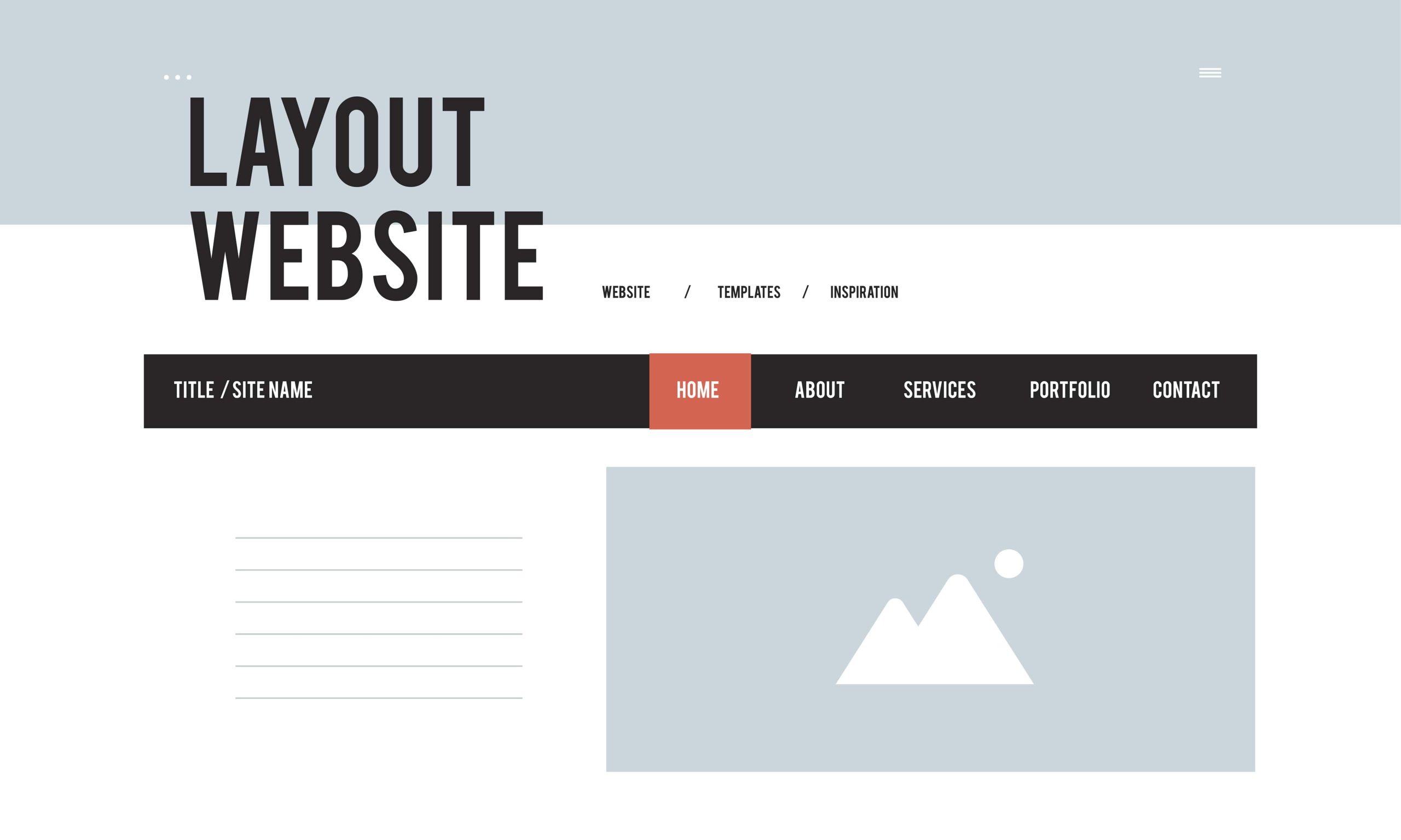
Watch how someone actually uses a website for the first time and you will notice their eyes go to the header navigation before anything else on the page. It is the map. Get it wrong, hide it behind a confusing icon, bury the pages people actually want under three levels of dropdowns, and visitors leave without ever seeing your best content. Get it right and the rest of the site barely matters, because people can find what they need regardless of how the homepage looks.
This guide covers building a header navigation menu in WordPress from the ground up: the classic Appearance > Menus method that still runs the majority of WordPress sites, the newer block-theme Navigation block approach, mega menus and mobile handling for larger sites, and the specific fixes for the handful of ways header menus commonly break.
Why the Header Menu Carries More Weight Than It Looks Like
A header menu does four jobs at once, and most site owners only think about the first one.
It orients a new visitor immediately. Someone lands on a page from a Google search or a social share, has no idea what else the site offers, and the header menu is the fastest way to answer “what is this site and what can I do here.” A cluttered or missing menu forces that visitor to guess, and most will not bother.
It shapes how search engines understand your site structure. Internal links inside the header menu are among the first links a crawler follows on every page, since the header appears site-wide. A logical menu hierarchy, top-level categories with sensible sub-items, tells search engines which pages you consider important enough to link from every single page on the site.
It carries your brand’s first impression. Font choice, spacing, hover states, and whether the menu feels cluttered or considered all register before a visitor reads a single word of content.
And it gets people to the pages that make money or drive the goal of the site, whether that is a contact form, a pricing page, or a shop. Burying your highest-value page three clicks deep in a submenu is a common and easily fixed mistake.
Method 1: Classic Themes (Appearance > Menus)
Most WordPress sites still run on classic (non-block) themes, and the menu system there has barely changed in a decade because it does not need to. That stability is a feature, not a limitation: a menu built five years ago on a classic theme still works exactly the same way today, which is more than can be said for most software.
Step 1: Confirm your theme supports a header menu location
Nearly every theme built in the last several years registers at least one menu location, usually called “Primary,” “Header,” or “Main Menu.” You can check by going to Appearance > Menus and looking at the “Menu Locations” section near the bottom of the screen, or under the “Manage Locations” tab. If your theme lists zero locations, it either does not support custom menus (rare in any theme from the last ten years) or you are looking at a page builder theme where navigation is handled inside the builder itself rather than the native WordPress menu system.
Step 2: Build the menu
- Go to Appearance > Menus in your dashboard.
- Click “create a new menu” if you do not already have one, and give it a clear internal name like “Main Menu” or “Header Nav.” This name is for your own reference and does not display on the front end.
- On the left panel, you will see tabs for Pages, Posts, Custom Links, and Categories. Check the boxes next to the pages you want included and click “Add to Menu.”
- The items now appear on the right, in a stacked list. Drag them into your preferred order.
- To create a dropdown, drag a menu item slightly to the right and slightly below the item you want it nested under. WordPress will indent it automatically once it snaps into position, signaling it is now a sub-item.
- Under “Menu Settings” at the bottom, check the box for your theme’s primary or header location, then click “Save Menu.”
Custom Links deserve a specific mention: this field lets you add a menu item pointing to any URL, including anchor links on the same page (#pricing), external sites, or a page that is not part of your standard WordPress Pages list. It is the most flexible option in the whole menu builder and the one beginners overlook most often.
Also Read: Should I Remove Polyfill from WordPress
Method 2: Block Themes (Navigation Block and Full Site Editing)
If your site runs a block theme, Twenty Twenty-Five, Kadence’s block variant, or any theme built for Full Site Editing, header navigation works differently and is arguably more visual, though it takes a moment to find if you are used to the classic system.
- Go to Appearance > Editor (this replaces the classic Customizer on block themes).
- Click into the header template part, usually visible as a distinct region at the top of the template preview.
- You will find a Navigation block already placed inside the header on most themes. Click into it to edit directly.
- Add, remove, or reorder items using the block toolbar. You can add a Page Link, Custom Link, or even a Submenu block nested inside for dropdown behavior.
- Style options (typography, spacing, colors, and the mobile “hamburger” icon behavior) live in the block’s right-hand sidebar under Settings and Styles.
- Save the template, and the change applies site-wide immediately since header template parts are shared across every page using that template.
The Navigation block also supports responsive behavior natively: you can set a breakpoint where the horizontal menu collapses into a mobile overlay, without installing a separate mobile menu plugin. This is one of the genuine advantages block themes have over classic themes for navigation specifically.
Mega Menus and Multi-Level Dropdowns
Standard WordPress dropdowns handle two, sometimes three, levels of nesting reasonably well. Once a site has enough content that a single dropdown would need fifteen or twenty items, a mega menu (a wide panel showing multiple columns, sometimes with icons or thumbnail images) becomes the better option.
Max Mega Menu is the most widely used plugin for this, working with both classic and most block themes. It replaces standard dropdowns with a configurable panel that can show columns of links, widgets, or even a small image grid, and it works without touching a line of CSS for basic layouts. For sites with dozens of categories or a large product catalog, a mega menu keeps the header from becoming an unreadable wall of nested submenus.
Before reaching for a mega menu, check whether the underlying problem is really navigation depth or category structure. A site with forty pages crammed into one dropdown often actually needs better top-level categorization first; a mega menu can mask a structural problem rather than solve it.
Mobile Navigation
More than half of most sites’ traffic arrives on a phone, and a desktop-style horizontal menu simply does not fit a 375px screen. Handling this correctly matters as much as the desktop layout.
Most modern themes, both classic and block, automatically collapse the header menu into a hamburger icon below a set breakpoint (commonly around 768px or 900px wide) and reveal it as a slide-out or overlay panel on tap. Before installing anything extra, check your theme’s own mobile behavior first by resizing your browser window or using your browser’s device toolbar, since a plugin is unnecessary if your theme already handles this well.
If your theme’s mobile menu is clunky, cuts off items, or does not appear at all, WP Mobile Menu is a dedicated plugin built specifically to override the default mobile navigation with a cleaner, app-style slide-out panel, independent of whatever your theme does on desktop.
Sticky Headers
A sticky header, one that stays pinned to the top of the viewport as a visitor scrolls down the page, keeps navigation available without forcing a scroll back to the top. Many themes now include a native sticky header toggle under Appearance > Customize or the block theme’s header settings. If yours does not, Sticky Menu (or Anything!) on Scroll is a lightweight plugin that pins any element, including a header built by a page builder, without requiring theme-level support.
Sticky headers work best when kept slim. A tall sticky header with a large logo and multiple rows of navigation eats a meaningful chunk of a phone screen’s vertical space on every scroll, which annoys mobile visitors more than it helps them.
Accessibility and Keyboard Navigation
A navigation menu that only works with a mouse excludes a real portion of visitors. WordPress’s default menu walker generates keyboard-accessible markup out of the box in most core and well-coded themes, meaning a visitor can Tab through top-level items and press Enter or the down arrow to open a submenu without touching a mouse. Custom menu implementations built entirely in a page builder sometimes skip this, so it is worth testing: click into the address bar, then press Tab repeatedly, and confirm you can reach and open every menu item using only the keyboard. If a submenu never opens this way, that is worth fixing before launch, both for genuine accessibility and because it is one of the checks automated accessibility scanners run first.
Styling the Navigation Bar
Once the structure works, styling usually comes from one of three places, and mixing all three at once is how sites end up with conflicting, hard-to-debug CSS.
The Customizer (classic themes) or the Navigation block’s Styles panel (block themes) covers font size, color, spacing, and alignment for most themes without any code. This should be your first stop.
Theme-specific settings panels, common in premium themes like Astra, Kadence, and GeneratePress, often expose deeper controls: hover animations, underline styles, and per-breakpoint typography that the base Customizer does not surface.
Custom CSS, added under Appearance > Customize > Additional CSS for classic themes or the Additional CSS panel in the Site Editor for block themes, is the fallback for anything the theme’s own settings do not expose. A simple example that changes the header background color:
.site-header {
  background-color: #1a1a2e;
}

.main-navigation a {
  color: #ffffff;
}
Inspect the actual class names in your browser’s developer tools before writing custom CSS, since selectors vary significantly between themes.
Adding a Button, Icon, or Widget to the Menu
A plain text menu works for most sites, but a call-to-action button, a phone number, or a small search icon inside the navigation bar itself can pull real weight for a business site.
On classic themes, many page builders and premium themes add a “Button” style option to individual menu items directly inside Appearance > Menus, letting you turn the last item, often “Get a Quote” or “Contact Us”, into a visually distinct button rather than a plain link. If your theme does not offer this natively, a short CSS rule targeting that specific menu item’s class, visible in your browser’s inspector, does the same job.
On block themes, you are not limited to Page Link and Submenu blocks inside the Navigation block. You can drop in a Search block for an inline search field, a Social Icons block for header social links, or a Button block styled to match your brand, all inside the same Navigation block container, and they will inherit the same responsive collapse behavior as the rest of the menu on mobile.
Phone numbers deserve a specific mention for service businesses: a tel: link (<a href="tel:+15551234567">) added as a Custom Link turns the number into a tap-to-call button on mobile automatically, no plugin required.
Troubleshooting Common Header Menu Problems
Menu not appearing in the header at all. Nine times out of ten this is a location assignment problem: go back to Appearance > Menus and confirm the correct location checkbox is ticked under Menu Settings. On block themes, confirm the Navigation block in your header template part is actually referencing the menu you built and not an empty placeholder.
Dropdown items not showing on hover or tap. This is almost always a JavaScript conflict, usually a caching plugin serving a stale, minified script, or a second plugin also trying to control menu behavior. Clear your caching plugin, check your browser console for JavaScript errors, and temporarily deactivate other menu-related plugins one at a time to isolate the conflict.
Menu items overflowing or wrapping oddly on smaller desktop screens. This usually means the menu has more top-level items than the header has horizontal room for at that specific viewport width, a gap between “mobile” and “full desktop” that many themes handle poorly. Reducing top-level items and moving less-important pages into a dropdown, or a footer menu instead, is the most reliable fix.
Mobile menu icon shows but nothing happens on tap. Almost always a JavaScript loading issue, either a script conflict or a caching plugin excluding a needed file from minification. Test in an incognito window with caching temporarily bypassed before assuming the theme itself is broken.
Menu order resets after a theme or plugin update. Rare, but it happens when an update resets menu location assignments rather than the menu items themselves. Check Appearance > Menus first, since the menu content is almost always intact even when the location checkbox got unchecked during the update.
Frequently Asked Questions
Can I have different menus for logged-in and logged-out visitors?
Not natively through the standard menu system, but plugins like Nav Menu Roles or Menu Item Visibility Control let you show or hide specific menu items based on login state or user role. This is useful for member-only areas or account dashboards that should only appear once someone is signed in.
Why does my menu look different on mobile than what I designed?
Most themes apply a separate mobile navigation pattern (the hamburger and slide-out panel) rather than simply shrinking the desktop menu. This is intentional; a horizontal menu with six items rarely fits usably on a 375px screen no matter how small the font gets. Test the actual mobile pattern your theme uses rather than assuming it mirrors the desktop version.
How many items should a header menu have?
Five to seven top-level items is the practical ceiling for most sites before the menu starts feeling cluttered or requiring a mega menu. If you find yourself needing more, that is usually a sign some items belong in a dropdown, a footer menu, or should not be primary navigation at all.
Do I need a plugin to add a search icon to my navigation?
Many themes include a built-in search icon toggle under the Customizer or block theme header settings. If yours does not, most menu plugins including Max Mega Menu support adding a search field directly into the menu bar without a separate plugin.
Will changing my menu structure hurt my SEO?
Reorganizing menu items does not directly affect rankings, but if you remove pages from the menu without redirecting their old URLs, or if the new structure buries pages search engines were previously crawling frequently through the header, indexing can slow down for those pages. Keep URLs stable and use 301 redirects for anything you actually delete.
Can I add a different logo or menu for a single landing page?
Yes, though it takes a bit more setup. Conditional logic plugins can swap the assigned menu location per page or template, and some page builders let you override the global header entirely on specific landing pages, useful for a campaign page that intentionally strips out the normal navigation to keep visitors focused on a single call to action.
A navigation menu is one of the few elements on a WordPress site that every single visitor interacts with, whether they notice it or not. Build it around what people actually came to find rather than what your site map happens to contain, keep the dropdown depth shallow, test it on an actual phone before launch, and it will do its job quietly in the background while the rest of the site gets the credit.
Interesting Reads
10 Best AI Builders for Shopify